BK76 guide · Colour and finish
Furniture colour: NCS and RAL charts, matt and gloss. How can you choose a finish with confidence?
Choosing a furniture colour means much more than specifying white, grey or beige. The same shade can look different on a matt cabinet door, a glossy lacquered surface and a wall. It also changes with lighting and the neighbouring timber, worktop and flooring.
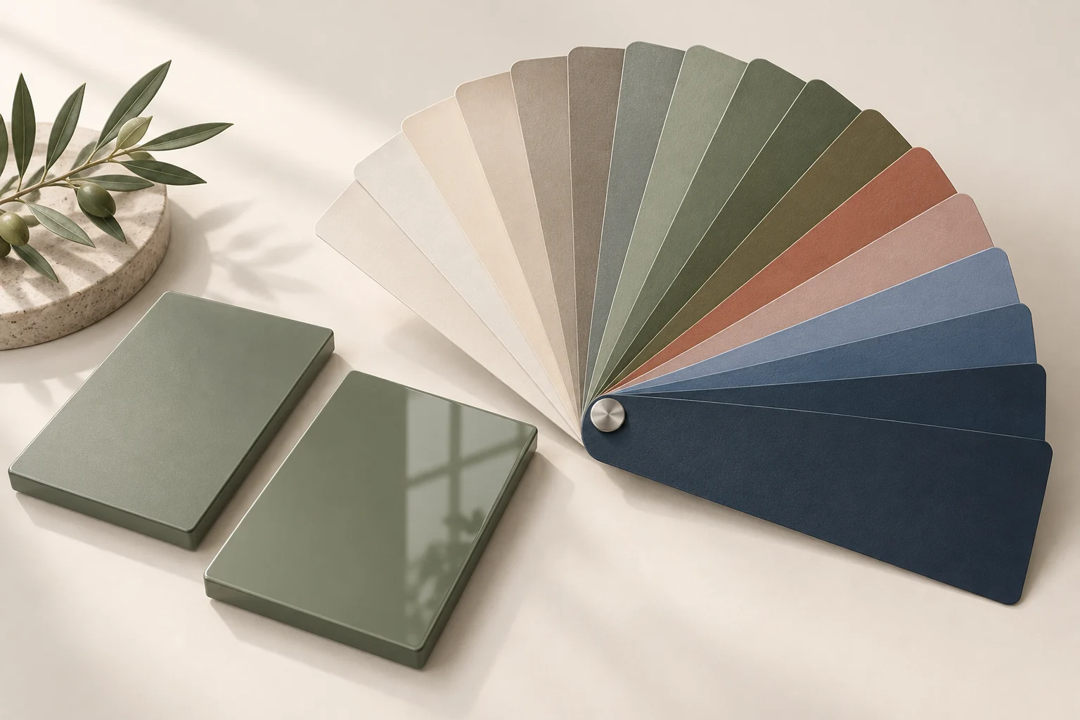
How, then, can you choose a bespoke furniture colour that meets your expectations? Basic colour theory, NCS and RAL charts, and a deliberate choice of gloss level can help.
Colour theory basics — what are we actually choosing?
In everyday conversation, we use names such as ‘warm white’, ‘olive’ or ‘graphite’. They are useful but do not define a surface’s appearance precisely. It helps to distinguish three basic colour characteristics:
- Hue — indicates whether a colour belongs to the green, red, blue or another hue family.
- Lightness — describes how light or dark the colour appears.
- Saturation — distinguishes an intense colour from a muted, greyish one.
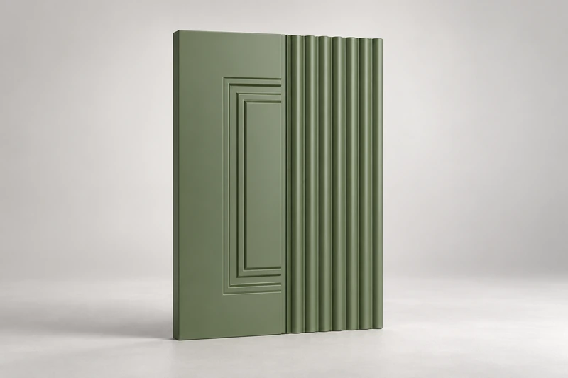
Two green kitchens can have completely different characters. A pale, muted green creates a calm backdrop, while a dark, strong green becomes a prominent feature of the interior.
Warm and cool colours
Beiges, reds and many yellows are usually perceived as warm; blues and some greys as cool. This is not a rigid division, however: white, grey and green can also have warmer or cooler characters.
This is why cabinet doors should not be chosen in isolation from other materials. A cool white beside a warm cream wall may look different from what we expected. A grey cabinet door paired with wood may reveal a subtle green or violet undertone that was previously barely visible.
How do you combine colours in furniture and interiors?
A good starting point is to choose one dominant colour and a limited number of complementary colours.
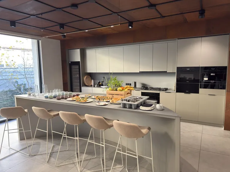
Calm combinations can be built using different lightness levels of a similar shade: light cabinet doors, a slightly darker wall and a more pronounced worktop. Greater contrast comes from pairing light surfaces with dark ones or combining colours of different character.
Not every element needs to draw attention. If the worktop has a strong pattern, simple plain-coloured cabinet doors can balance it well. With a quieter worktop, there is more room for colour, routing or texture on the doors.
NCS — a language for describing colour
NCS, or the Natural Colour System, describes colour through its perceived similarity to elementary colours: white, black, yellow, red, blue and green.
In the designation NCS S 2050-Y90R:
- 20 indicates the degree of similarity to black;
- 50 indicates chromaticness, or the proportion of perceived chromatic character;
- Y90R describes a hue between yellow and red, much closer to red.
The remaining part of the nuance description corresponds to perceived similarity to white. These are not pigment proportions or instructions for mixing lacquer.
NCS helps compare colours and create combinations with shared characteristics. It is a useful tool when matching cabinet doors to walls, fabrics and other furnishings.
RAL — a widely used colour chart in production
RAL is often used to specify colours of lacquers and coatings. In the popular RAL CLASSIC shades have four-digit codes.
Remember that RAL is not a single collection. There is also RAL DESIGN SYSTEM plus, whose seven-digit notation refers to hue, lightness and chroma. Its codes should not be interpreted in the same way as RAL CLASSIC codes.
A RAL number makes communication between client, designer and maker easier. It does not replace a specification of surface type and finish.
Can NCS and RAL be used interchangeably?
Do not assume that every NCS colour has an identical RAL equivalent. A suggested ‘closest match’ may only be an approximation.
When matching cabinet doors to a wall or a metal component, compare physical samples. Similar names or a close on-screen appearance do not guarantee a match.
Gloss — the second important decision after colour
Gloss level describes how a surface reflects light. It is a separate characteristic of the finish that the colour code alone does not describe.
Furniture finishes include deep matt, matt, satin, semi-gloss and high gloss. These names do not always describe the same effect from different manufacturers.
Gloss is measured with a glossmeter, and the result is expressed in GU. It is not simply the percentage of reflected light. The result should be considered together with the measurement angle: geometries including 20°, 60° and 85° are selected to suit the surface.
This is why ‘20 GU at 60°’ is more precise than simply ‘semi-matt’. In practice, the most important reference for the client remains the approved sample against which finished cabinet doors can be compared.
Gloss levels — what do numbers such as 5, 20 or 90 mean?
Lacquer descriptions may use terms such as ‘gloss 5’, ‘gloss 20’ or ‘gloss 90’. These usually refer to a nominal gloss level, but the notation should be checked in the specific product’s documentation. A number alone, without units and measurement angle, is not a complete specification.
Gloss Units (GU) are units of gloss, not percentages. A result of 20 GU therefore does not mean that a surface reflects 20% of the light. The measurement is relative to a standard and a specified geometry. The scale does not have an absolute upper limit of 100 GU — some surfaces can give higher readings.
For a general coating assessment, measurement at 60° is the starting point. This is used to select a geometry suitable for more detailed comparison:
| Measurement at 60° | Gloss characteristics | Comparison geometry |
|---|---|---|
| Below 10 GU | Low gloss | 85° — for more precise differentiation of matt surfaces |
| 10–70 GU | Intermediate range | 60° |
| Above 70 GU | High gloss | 20° — for more precise differentiation of glossy surfaces |
This is a rule for selecting measurement geometry, not a universal classification of commercial finish names into matt, satin and semi-gloss. Their boundaries can vary. Results obtained at different angles should not be compared as if they were the same measurement.
For example, a cabinet door measuring 5 GU at 60° has much lower gloss than one measuring 90 GU at 60°. A higher reading is not necessarily better. We choose the appropriate gloss to suit the interior and how it will be used. The clearest specification is: colour code, GU level with measurement angle, agreed tolerance and an approved sample.
Matt or gloss cabinet doors?
Matt cabinet doors give a calmer effect, with less distinct reflections of the surroundings. They work well with timber, stone and interiors based on natural materials. Matt does not automatically mean fingerprint-resistant, however — this depends on the particular surface.
Gloss cabinet doors create more pronounced highlights and reflections. They can give cabinetry a more luminous character, but also make surroundings, streaks and some surface irregularities more visible.
Satin and semi-matt can offer a middle ground: they retain a gentle reflection of light without a strongly mirror-like effect.
No gloss level is best for everyone. The choice should take the interior’s appearance, everyday use and care expectations into account.
Why is an on-screen colour not enough?
Photographs and visualisations help establish a direction, but they are not a binding colour reference. Their appearance is affected by screen settings, the camera, photographic processing and lighting.
View the sample where the furniture will be installed: in daylight and under the intended artificial lighting. Ideally, also stand it vertically, as the cabinet door will be positioned.
Two surfaces may look similar under one light and different under another. This phenomenon is called metamerism. It is another reason to compare materials together rather than separately.
How should cabinet door colour be specified before furniture is made?
A clear specification includes more than a number from a colour chart:
- The system and full colour code — NCS or the relevant RAL collection.
- Material and finish type — for example, lacquered MDF.
- Gloss level and any surface texture.
- A physical sample approved before production.
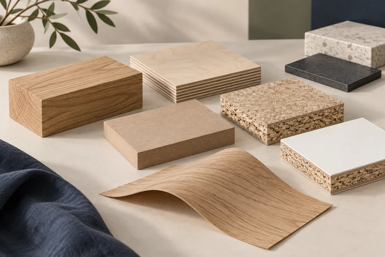
For timber and veneer, natural differences in grain and colour also need to be considered. Clear lacquer or oil does not behave in the same way as an opaque coating on a uniform substrate.
Bespoke furniture colours at BK76
When choosing furniture colours, consider the whole interior: cabinet doors, worktop, walls, floor and lighting. NCS and RAL charts give the discussion structure, but comparing actual materials is what makes an informed assessment possible.
Planning bespoke furniture in Wrocław? Contact BK76 and tell us about your project. Prepare inspiration, interior photographs and your chosen materials — they are a good starting point for discussing colour and finish.